


A Project on Jumia's Product Sales Insight; Using Adidas as a Case Study.


Table of contents

No headings in the article.
Five days ago, a 10-man team (data analytics portfolio group3) embarked on a journey to unravel the sales insight of a product in Nigeria or one used by Nigerians. We took on this project with the aim of carrying out data/web scraping, data cleaning and data visualization. We also decided to carry out our analysis with Microsoft PowerBI and Microsoft Excel. After much deliberation, we came to a great conclusion of carrying out our analysis on the 'Jumia' brand. A brand which has managed to stand out in spite of the fierce competition and has remained the number online shopping site in Nigeria for the past 10 years of its existence (happy 10 years anniversary Jumia!).
Data Scraping Using Python
Lets begin with a little explanation on what data scraping is. It is the process of importing information from a website into a spreadsheet or local file saved on ones computer. It is one of the most efficient ways to get data from the web, and in some cases to channel that data to another website. Our first step in the project was to search for related data on Kaggle (a data science company where you can search for datasets). We then used python programming language to scrape jumia's website by following the processes stated below:
We used a text editor called visual studio code, which is a very versatile text editor. Since we intended to write python codes on it, we installed a python extension to help us run python codes on it.
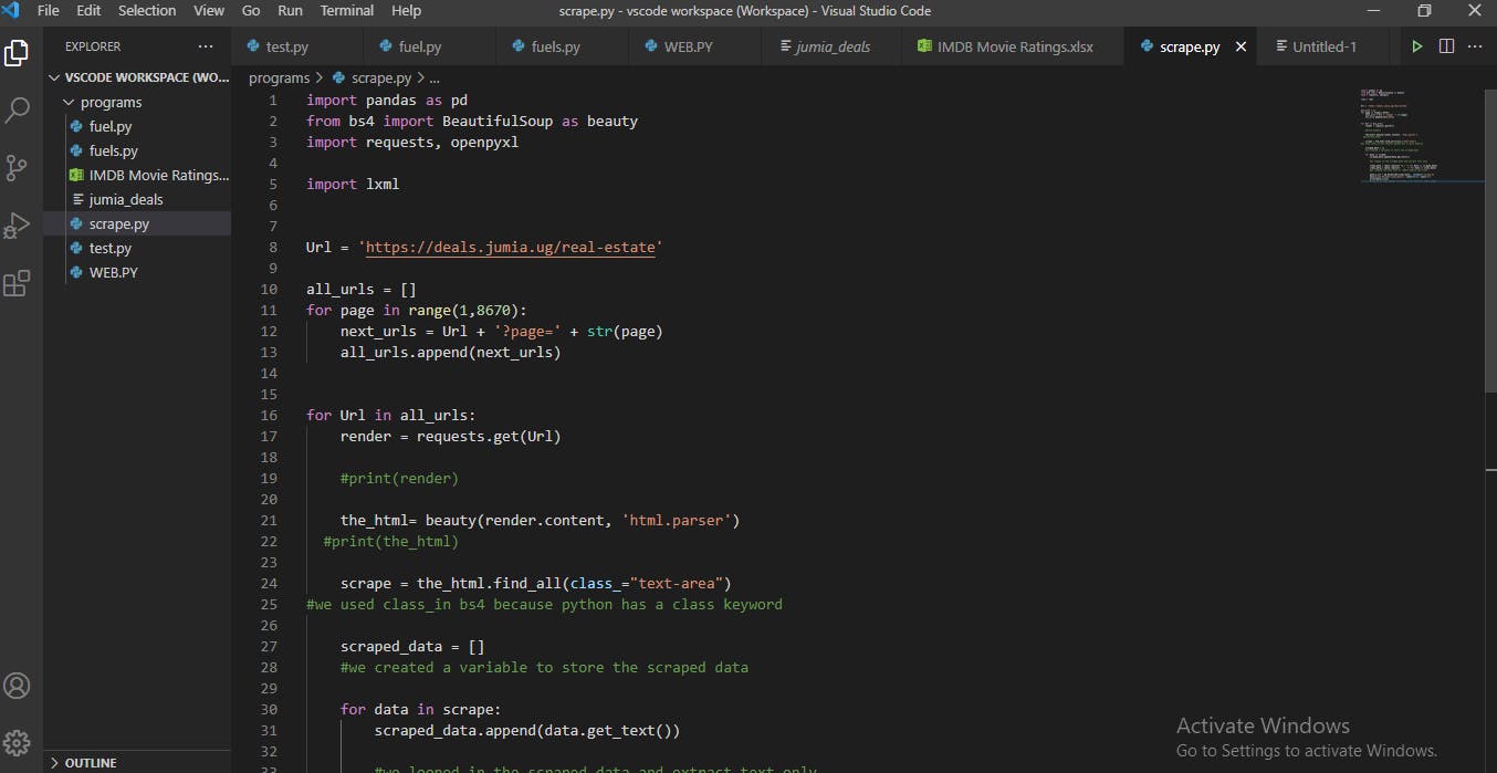
- We created a file called “Scrape.py”
- Since we need some python libraries like Beautiful soup, Requests, Pandas and Openpyxl for a successful scrapping, so we created a new terminal using the command prompt to install the libraries by using the format “pip install bs4”, “Pip install Requests”, Pip install pandas, Pip install Openpyxl.
- Afterwards, we wrote the codes that will import the installed python libraries.
- The requests library was then used to pass the html source code from the jumia website
- We also created a variable for our home url and used “a for loop” to pick data one page at a go.
- Using beautiful soup and requests allows us loop through our urls and use get() from the request library to create a connection and read the url.
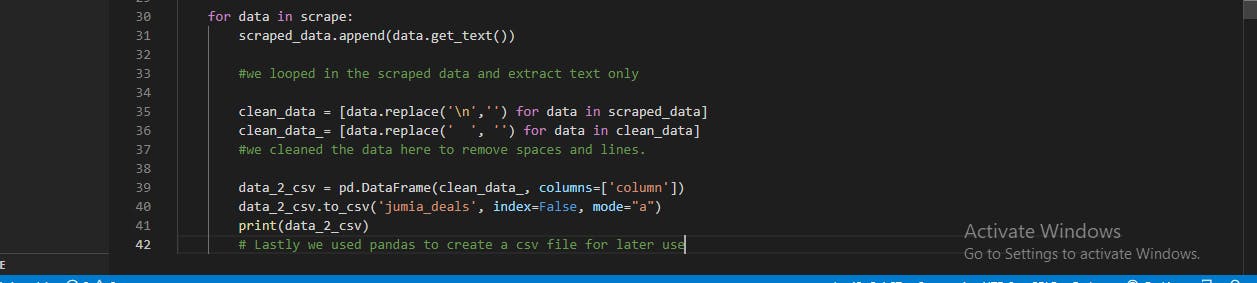
- Finally, we used pandas to save the script as a csv format. We also used pandas to do some cleaning on the data, we removed some spaces and lines.
Data Cleaning on Microsoft Excel
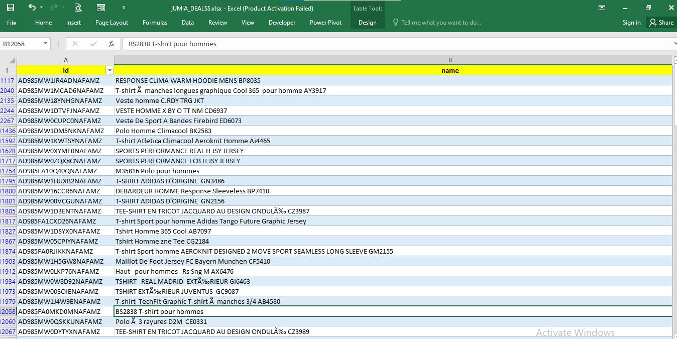
Data cleaning is the process of fixing or removing incorrect, corrupted, incorrectly formatted, duplicate, or incomplete data within a dataset. tableau.com/learn/articles/what-is-data-cle.. You can learn more about data cleaning through the link. After some of the cleaning was done with python, the csv file was copied and transferred to Excel for more cleaning. 'ctrl + T' was applied to turn the data to a table format. Here, we gave it an header and upon discovering that there were some blank spaces, we made use of the excel function 'Cntrl + G' to replace them with '0'.
Data Modelling With Microsoft Excel
Data models are visual representations of an enterprise’s data elements and the connections between them. By helping to define and structure data in the context of relevant business processes, models support the development of effective information systems. erwin.com/solutions/data-modeling/data-mode..
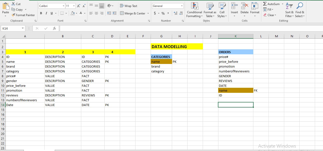
We went ahead to carryout our data modelling on an excel sheet to enable us carryout our analysis effectively. We did this by first copying the header of the dataset by clicking on 'ctrl + shift + right arrow key' and then used 'paste special' or 'alt+E+S' to paste the headers vertically on a new sheet. We grouped them in a such a way that whatever can't be regarded as a number that can be calculated, we referred to them as description and those that can be calculated as values. In the next column, we grouped them into tables and then in the following column we began to select our primary keys. A primary key is a special relational database table column (or combination of columns) designated to uniquely identify each table record. A primary key is used as a unique identifier to quickly parse data within the table. techopedia.com/definition/5547/primary-key
Next, we separated our data to two tables, namely; Category table and Orders table. Everything related to the category, falls under the category table and everything not in it falls under the orders table. Since name can be found in both tables, it becomes a foreign key in the orders table. A foreign key is a column or group of columns in a relational database table that provides a link between data in two tables. It acts as a cross-reference between tables because it references the primary key of another table, thereby establishing a link between them. techopedia.com/definition/7272/foreign-key
Transforming data with Power Query Editor
Power Query is a data transformation and data preparation engine. Power Query comes with a graphical interface for getting data from sources and a Power Query Editor for applying transformations. docs.microsoft.com/en-us/power-query/power-..
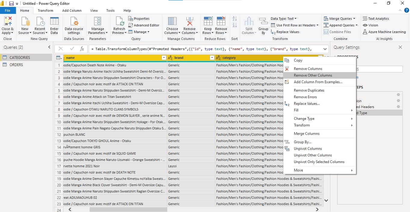
After our data modeling, we transferred the data to power query editor, through the Power BI desktop, for data transformation. Here, we duplicated the original table and renamed it with regards to our model data in excel. The first table was named 'categories' and the second was named 'orders'. We selected the category table to make it have just three columns which we had modelled and we deleted other columns. We repeated the same steps for the orders table as well. In the category table we removed duplicates and changed the data types to the right type. We also removed some errors from both tables and filtered filtered the brand column to only Adidas brand, since we decided to focus on it. Then we clicked on 'close and apply' to load the data on Power BI desktop and start our visualization process.
Creating a Calendar Table
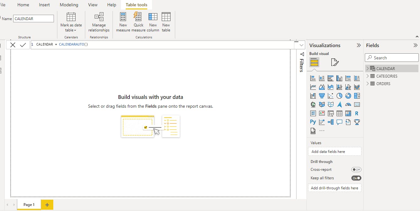
Upon loading the data on Power BI, we realized there was a need for a calendar table since we have a date column. This table would provide more functions about date. To get this, we used the Power BI function called 'calendar auto'. We selected the new column app, gave the table a name (calender) and wrote in the DAX formula section 'Calender = Calendarauto()'
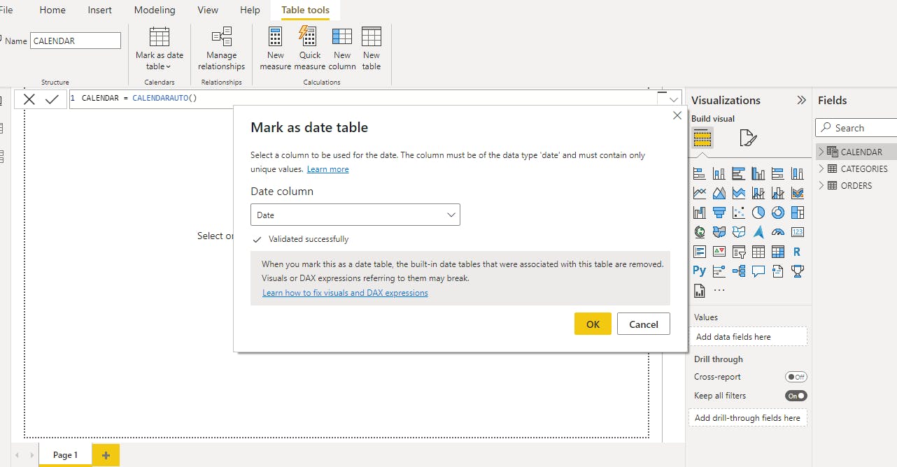 After creating the calendar table, we marked it by selecting the table and clicking on the tab above, then selected 'Mark as table'. After this, we ascertained that we marked it has a date table.
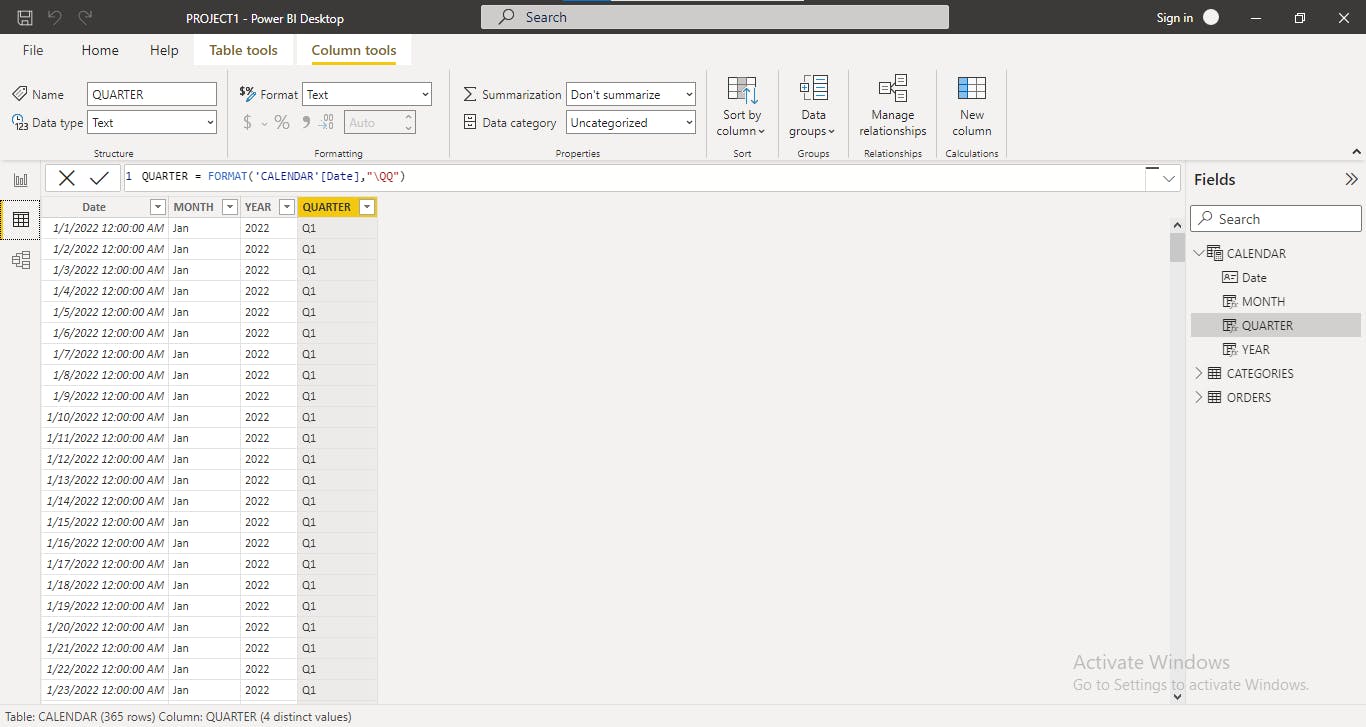 From the date, we decided to bring out the month, year and the quarter. We clicked on 'New column' and named the first one 'year'. The function that can carry out what we want in Power BI is called 'format', so we made use of this function - Year= format("calendar" [date],"\YYYY") We repeated the same thing for the month column as well, we wrote - Month= format("calendar" [date],"\MMM") and for the quarter column - Quarter= format("calendar" [date],"\QQ").
We went on to create some more measures on the category and order table, to help with our analysis and to help us reach an adequate conclusion. We created total category by selecting the categories table and clicked on new measure. It is important to know that what ever we do here only shows on the visualization aspect and not on the table aspect. The function to do this is known as 'Countrows(total category)'. We also created total orders using the formula 'Countrows(total orders)'. Likewise, we created a new measure for the sales of the previous months and the function that does this is the 'previous month' function- 'Countrows(previous month)'. Other essential measures which were created include the number of males(%Male= Divide([Male],[TOTAL_ORDERS],0) and number of females (%Female= Divide([Female],[TOTAL_ORDERS],0) and total price by using the total price function.
Relating Tables in Data Modelling
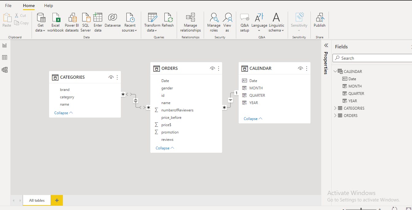
We discovered our tables were not related in the model section and this might result in problems during our analyis. To relate it, we must do so with a column that is common between the tables. We remembered that while doing our data modelling on excel, we had 'name column' on the primary table and categories table. That means it is the name column that can relate to the category table, so we drag it on the category table and it will produce a line to show there is now a relation. We also discovered we have date in the calendar and orders table, so we relate them as well because it is common between them.
Separating the Measures
 Here, we noticed we had a lot of measures and decided to separate them. So we created a table called ‘all measures’
Visualization on Power BI
Data visualization is the representation of data through use of common graphics, such as charts, plots, infographics, and even animations. These visual displays of information communicate complex data relationships and data-driven insights in a way that is easy to understand. ibm.com/cloud/learn/data-visualization
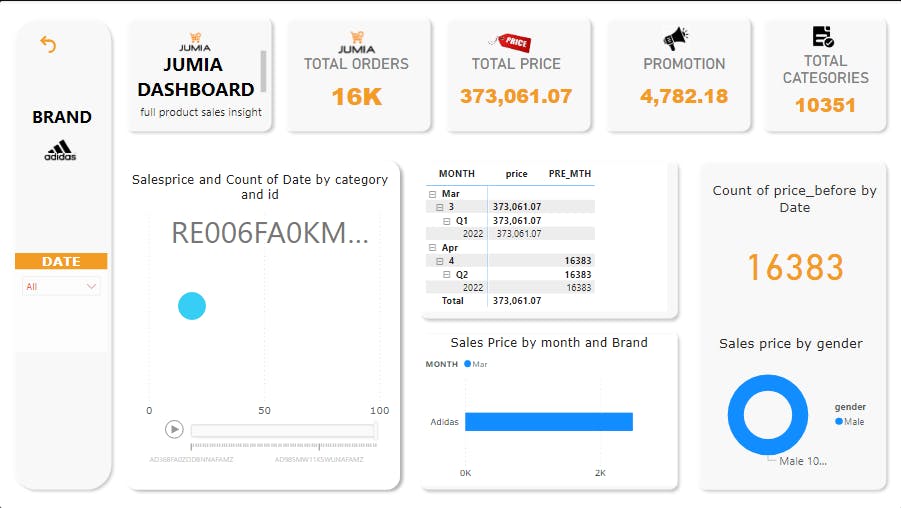
Our visualization started to take shape at this stage, this is where we started to create our Power BI dashboard. We didn’t want to just choose any color for the report and we were intentional about our color choice. Hence we settled for Jumia’s brand colors. For the total orders, total price, promotion, total categories and the Jumia brand display, we decided to use the card visuals. We used a scattered chat for the ‘salesprice and count of date by category and Id’ visual because we had so many things to display and this was the best choice for it. A play icon (play axis) was also included in this visual for interaction. The goal for us was to make our design simple, clear and readable. We also included a slicer, which is by date. Our next visual shows the month and the price of the brand by month and the price in the previous month, a measure we created ourselves, using a matrix table. The visual below it reveals the sales price per brand and month and a stacked bar chart was used here. While the one next to it shows two visuals; the price by gender (using a donut chart) and price of count before by date (using KPI).
Recommendation:
Based on our analysis, a lower percentage of men order Adidas products from Jumia, we recommend a price reduction to a more affordable rate so orders can increase. We also recommend that Jumia attempts to be more consistent with their pricing because when the price of the previous month is compared to that of March, there is a noticeable huge difference which can discourage potential customers. Another key recommendation is for Jumia to increase their promotions. We believe this will bring in more orders, which translates to more sales for the organization.
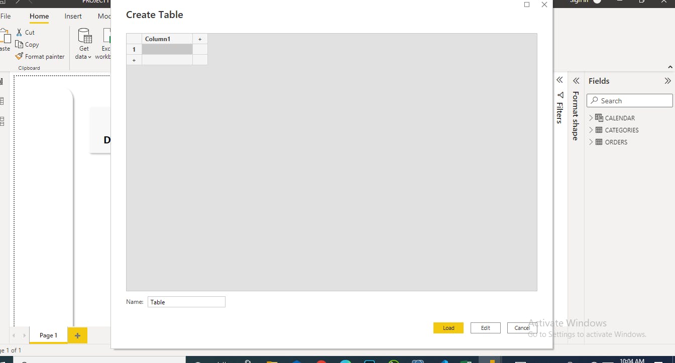
Creating a Data base
We discovered the need after our visualization, to create a data base using Postgres by writing some SQL programming languages. This was done to keep our data safe for future purposes. A database is an organized collection of structured information, or data, typically stored electronically in a computer system. oracle.com/database/what-is-database
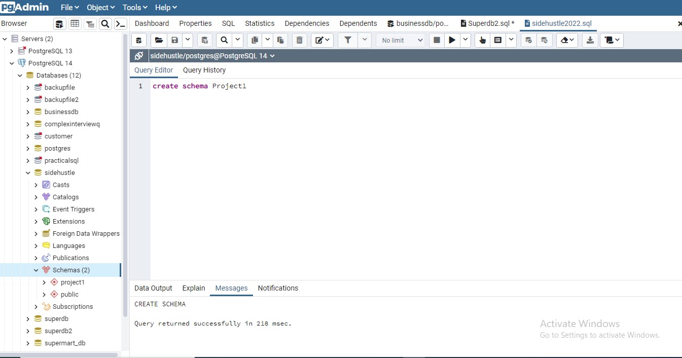
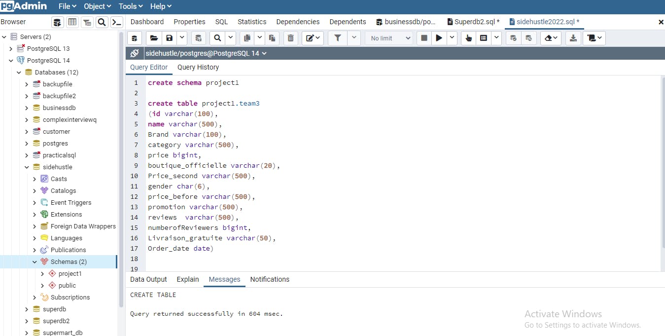
Firstly we created a database in PostgreSQL using the sql statement “Create database database name”. The database name is ‘sidehustle’. We then created a schema for proper arrangement of our project by using the sql statement “Create Schema project1”
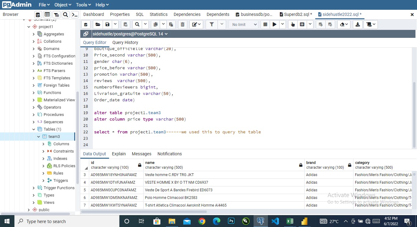
Furthermore a table was created using sql statement. The table name is ‘team3’. Then we saved our excel file in a csv format so that we can import it into sql. After which we then right clicked on our already created table and clicked on import to bring in our table. In the finals stage, we wrote an sql statement that will show us our imported table- Select * from project1.team3
Visualization on Excel
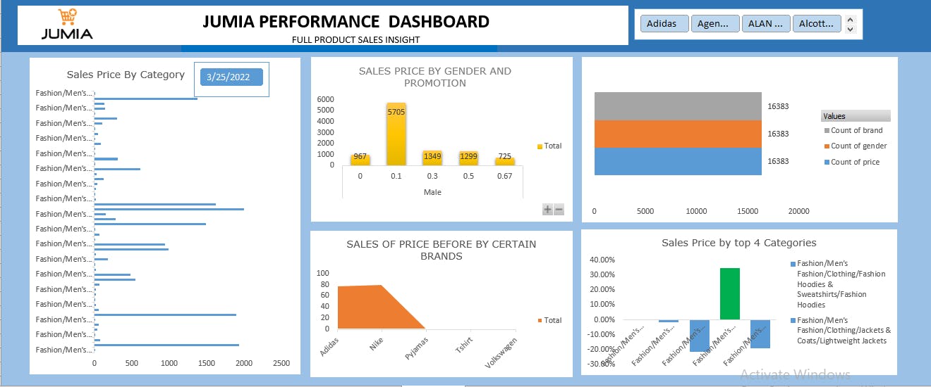
To achieve this dashboard we first selected our dataset with ‘ctrl + A’ and used ‘ctrl + T’ to make it a table then we used ‘alt + N + V’ to create a pivot table in a new worksheet. After we created the pivot table, we put the required fields into either values, rows or columns. Then we selected a pivot chart for each of the charts. When we had created the charts, we went ahead to copy and paste the first pivot table, change the fields, values and columns and choose a suitable chart. Just like with our Power BI visualization, the goal here was also to make our visualization simple, clear, readable and efficient.
On our excel dashboard, we provided information concerning the sales price by several categories and use a date slicer that is connected to only this chart, we were able to show the sales price by Gender and promotion. Also, we were able to show the Sales Price before by only 5 brands that are commonly used by Nigerians- Adidas, Nike, Pyjamas, T-Shirt and Volkswagen. Finally, we were also able to show the sales price by the top 4 categories.
Recommendation
Just like we recommended after the Power BI visualization, from the excel visuals, we also recommend that Jumia attempts to be more consistent with their pricing because when the price of the previous month is compared to that of March, there is a noticeable huge difference which can discourage potential customers. Jumia should also increase their promotions.